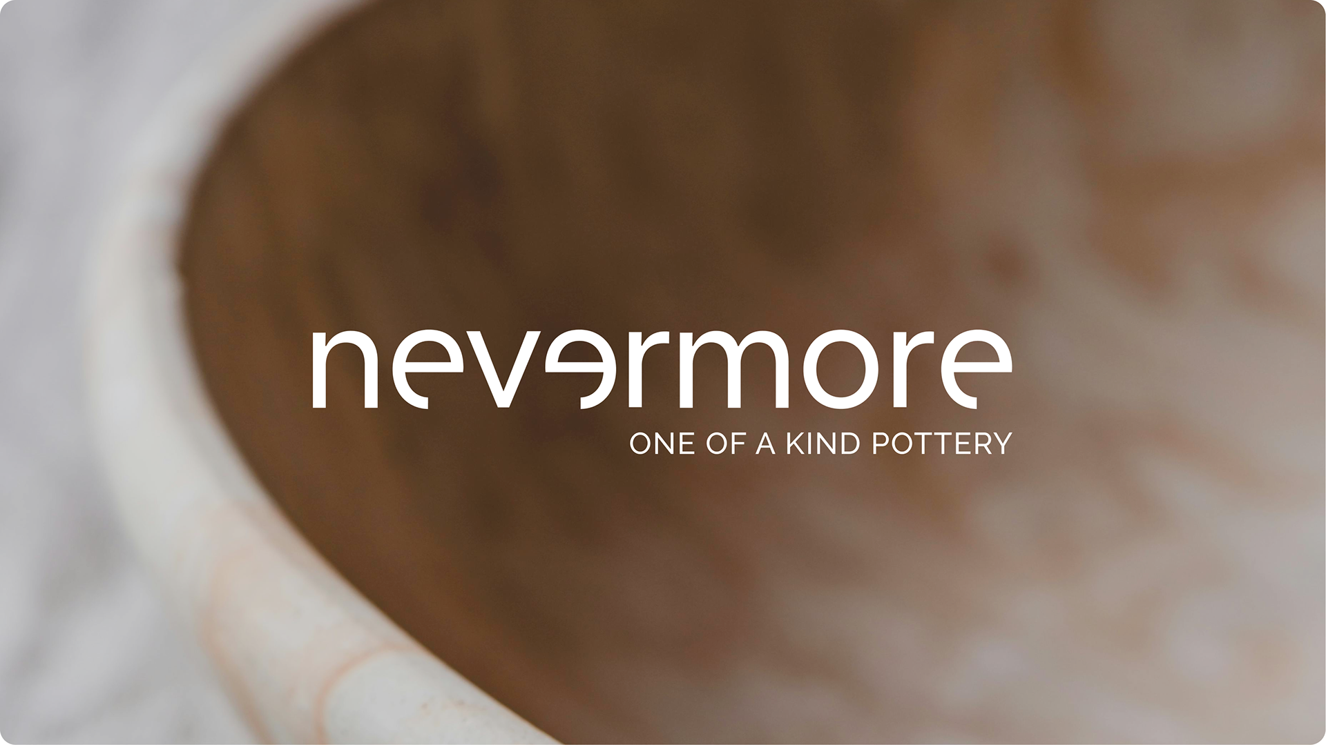
Nevermore is not just a pottery brand — it’s a statement about individuality, time, and care. Created by ceramicist Vitória Guarisse, Nevermore embraces the uniqueness of every handcrafted piece. At its core, the brand challenges mass production and uniformity by celebrating the imperfect, the emotional, and the irreplaceable. The visual identity needed to echo these values through a poetic and tactile design language that would feel as personal as the art itself.
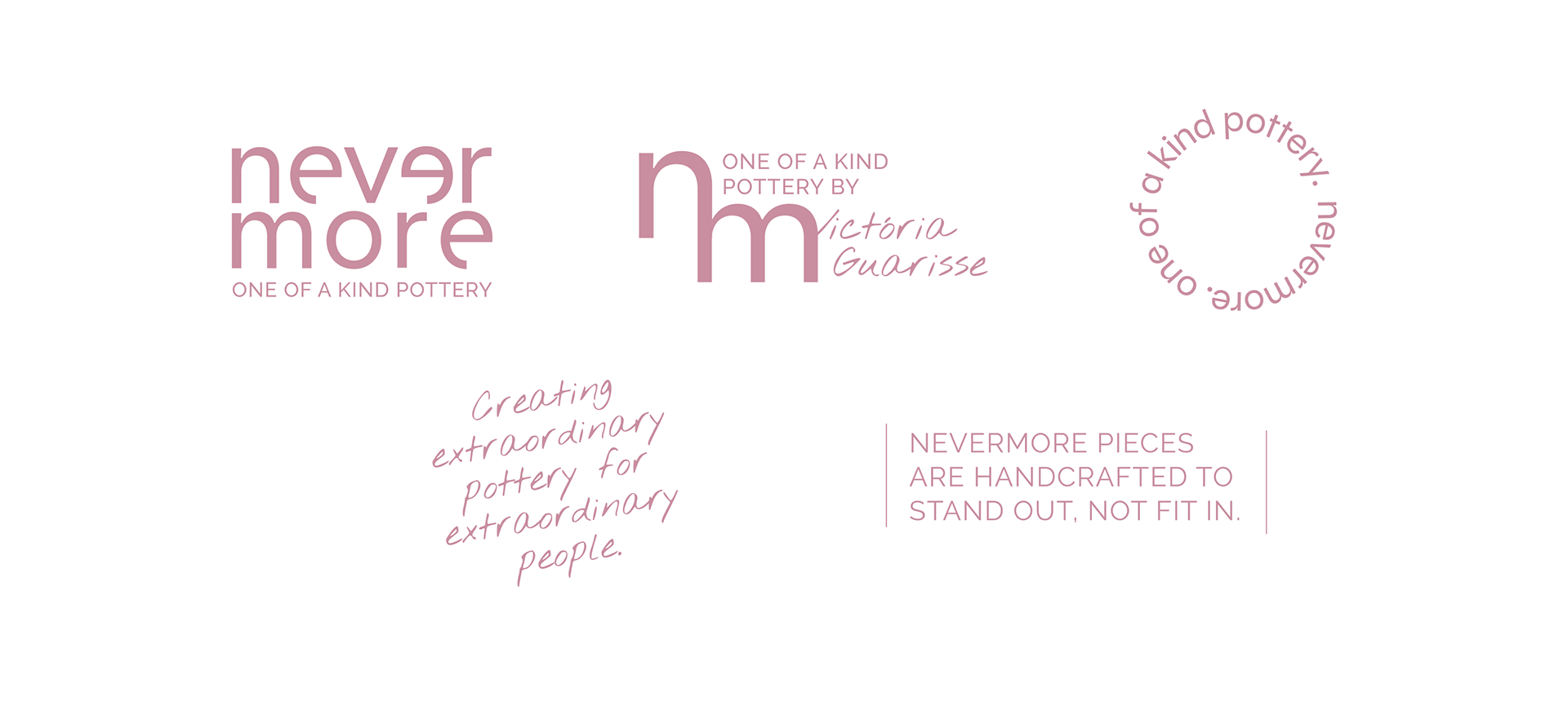
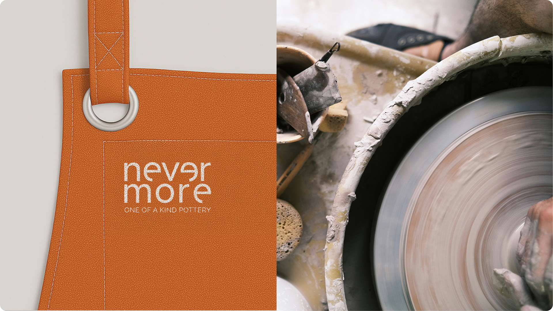
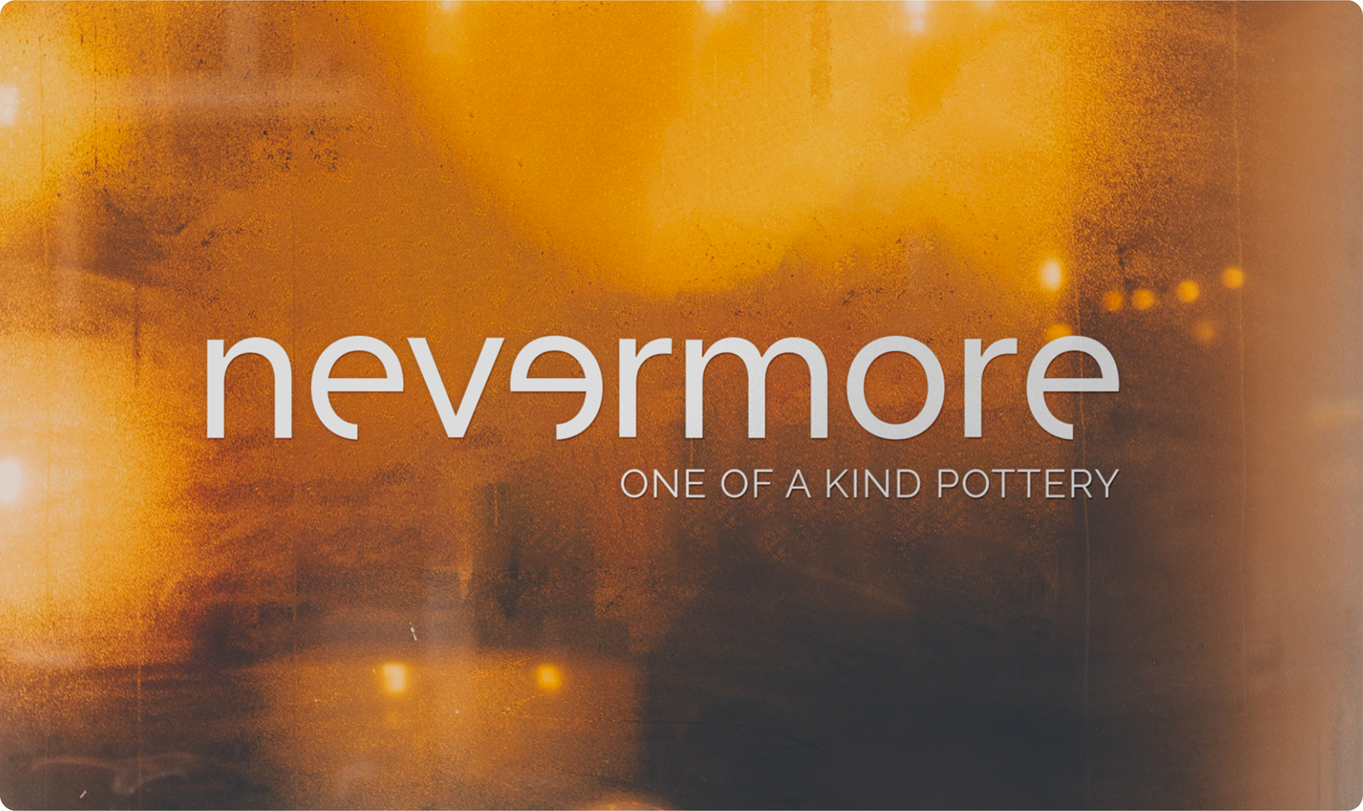
The entire identity was built around the brand’s philosophy: each piece is different, because each person is. Rather than aiming for perfection, we designed a system that welcomes irregularity, asymmetry, and warmth. The logotype reflects this intentionally — a modern, soft letterform with subtle quirks, where the flipped "e" becomes a symbolic break from convention. The overall rhythm of the brand is quiet, but confident — much like the work it represents.
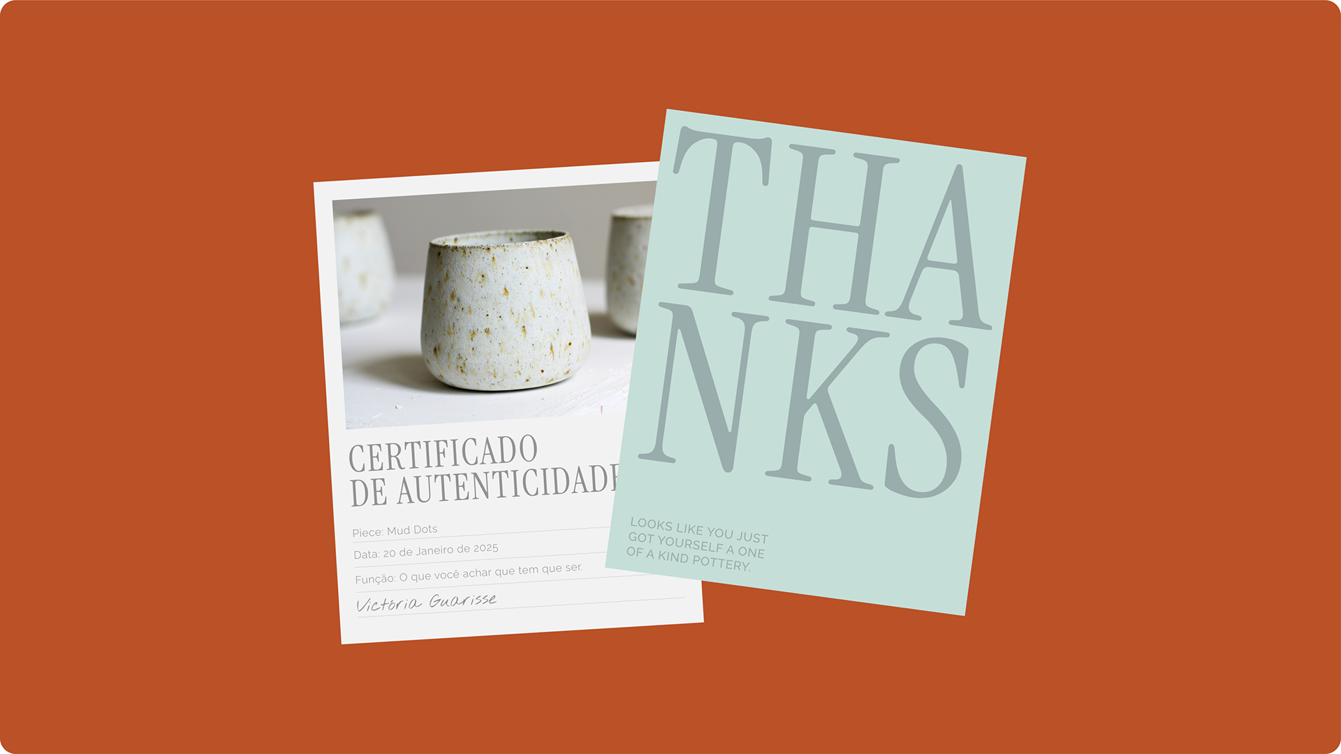
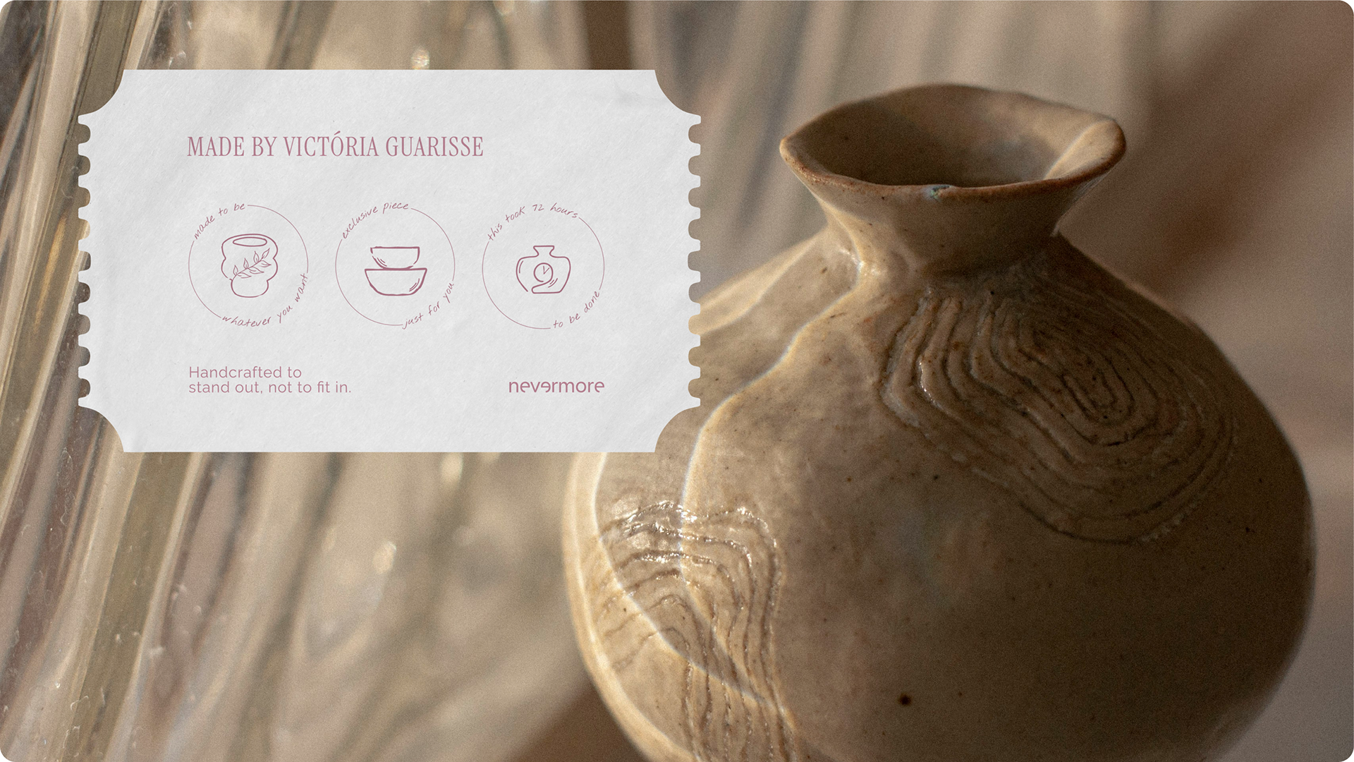
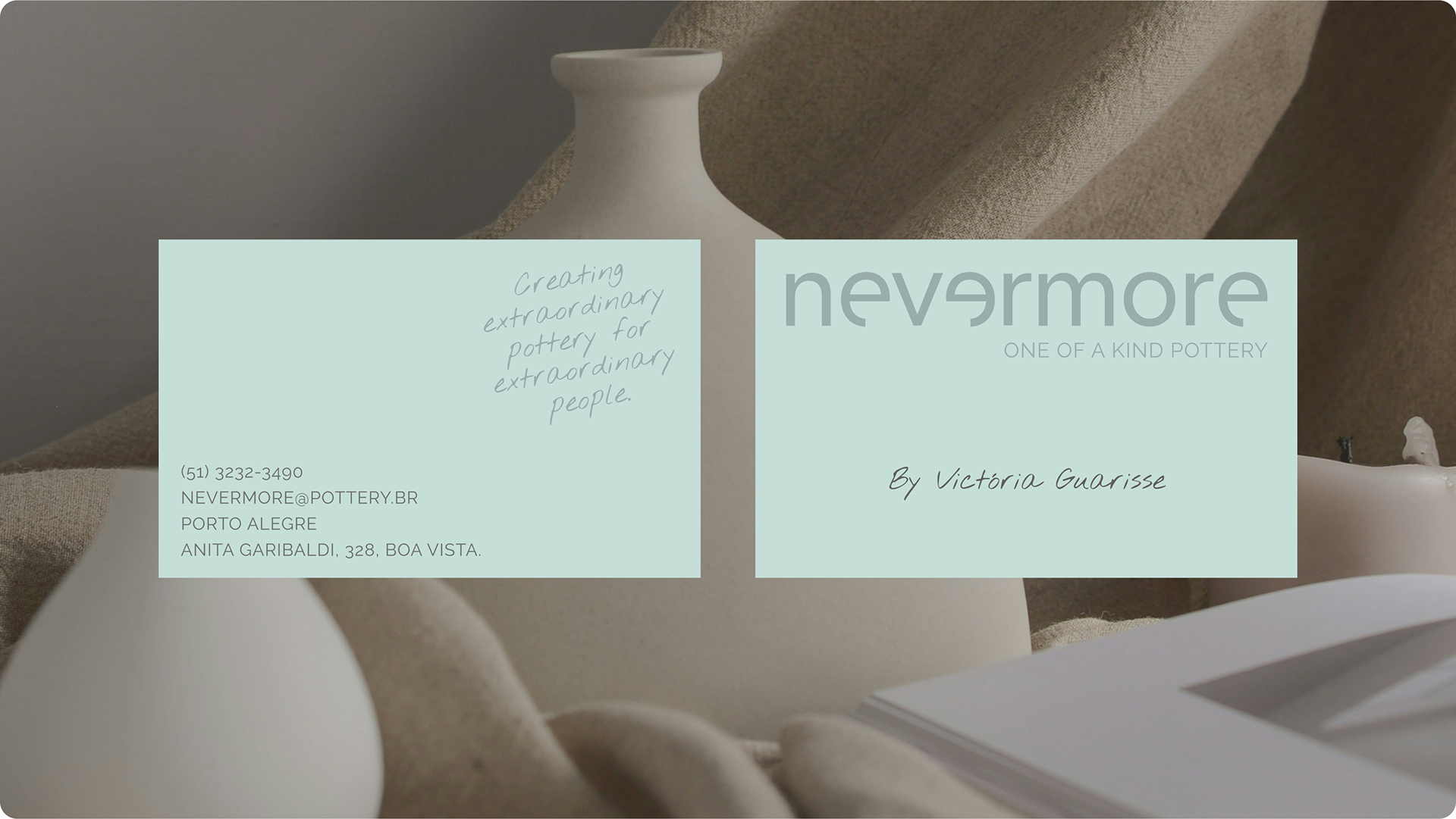
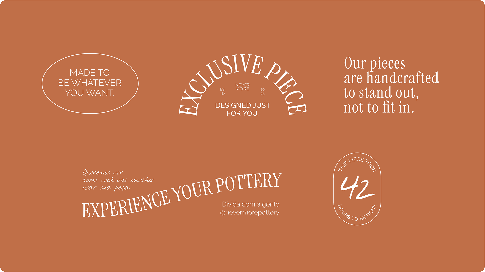
The color palette was chosen to reflect earth and soul. Terracotta and natural clay tones are dominant, grounding the brand in its material essence. These are softened with pale mint and soft white accents, creating balance and space to breathe. Every touchpoint — from labels to thank-you cards — evokes the feeling of something made by hand, not by machine.
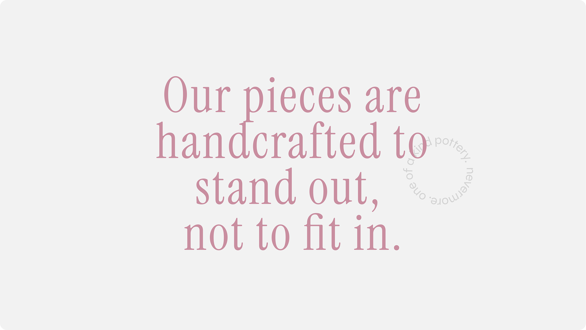
The verbal identity is as central as the visual one. Phrases like “Made to be whatever you want” and “Our pieces are handcrafted to stand out, not to fit in” act as brand signatures. They reinforce the customer’s role in giving meaning to each object — because in the end, it’s not just about how the piece looks, but how it is used, loved, and remembered.
Thanks!
Visual Identity | Nevermore
Design by Laura Mallmann
2025
Design by Laura Mallmann
2025