Clinia is a Brazilian healthtech company born with a bold purpose: to simplify and humanize the relationship between clinics and patients through artificial intelligence. In a sector often overloaded by complexity and bureaucracy, Clinia brings precision, lightness, and warmth. Our task was to translate this dual essence — tech and care — into a brand identity that could express both clarity and empathy.
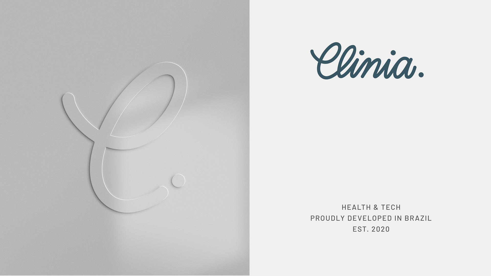
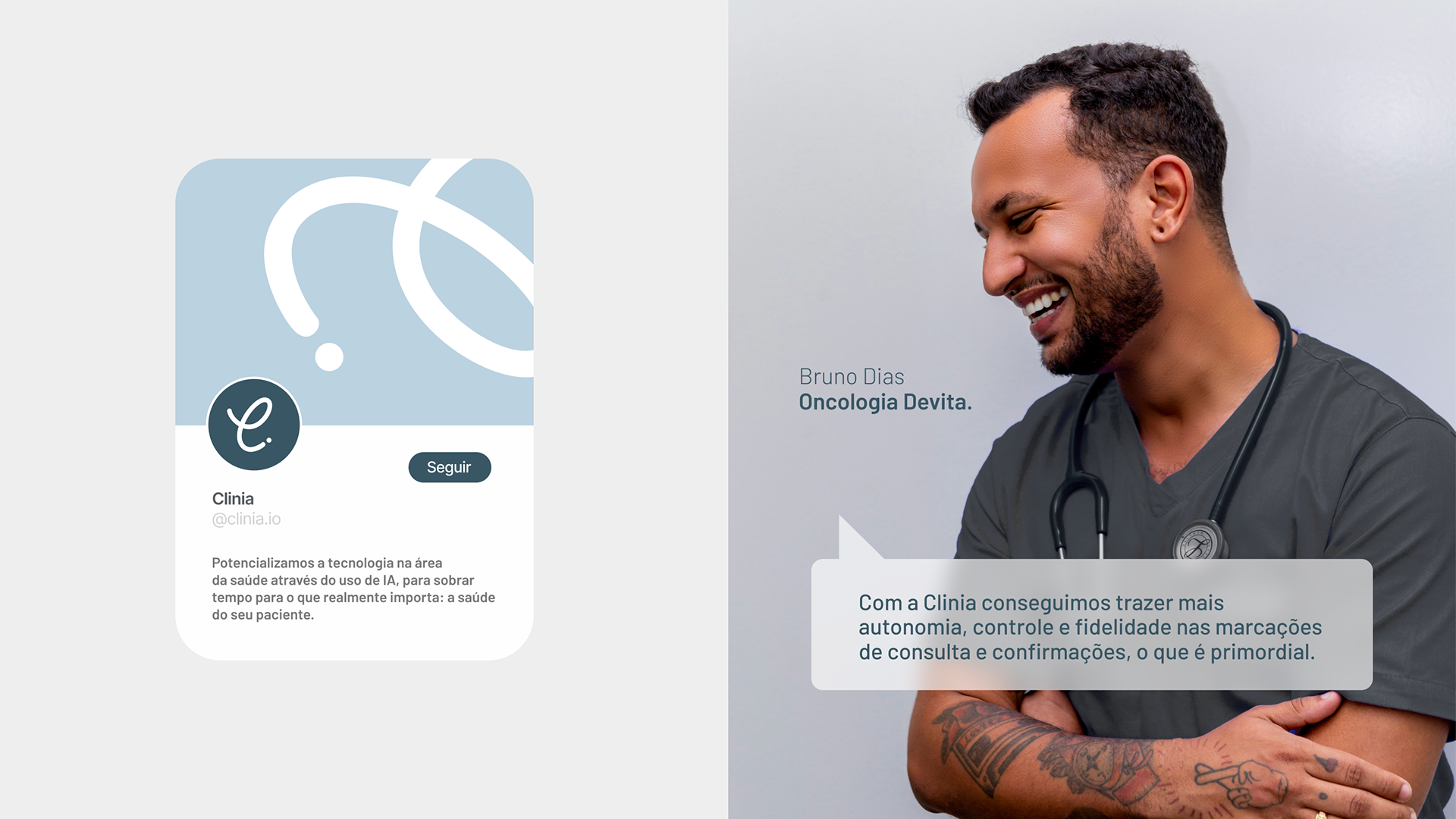
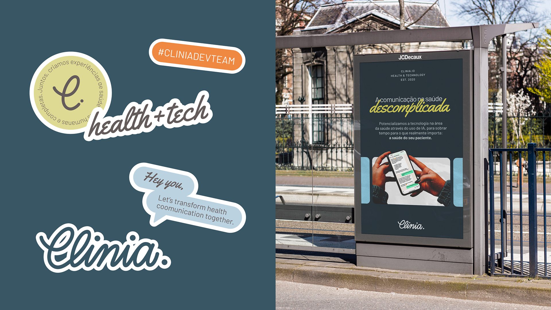
The core of the identity is the wordmark: “Clinia.” Handwritten in a fluid, approachable script, it feels warm and conversational — almost like a signature.
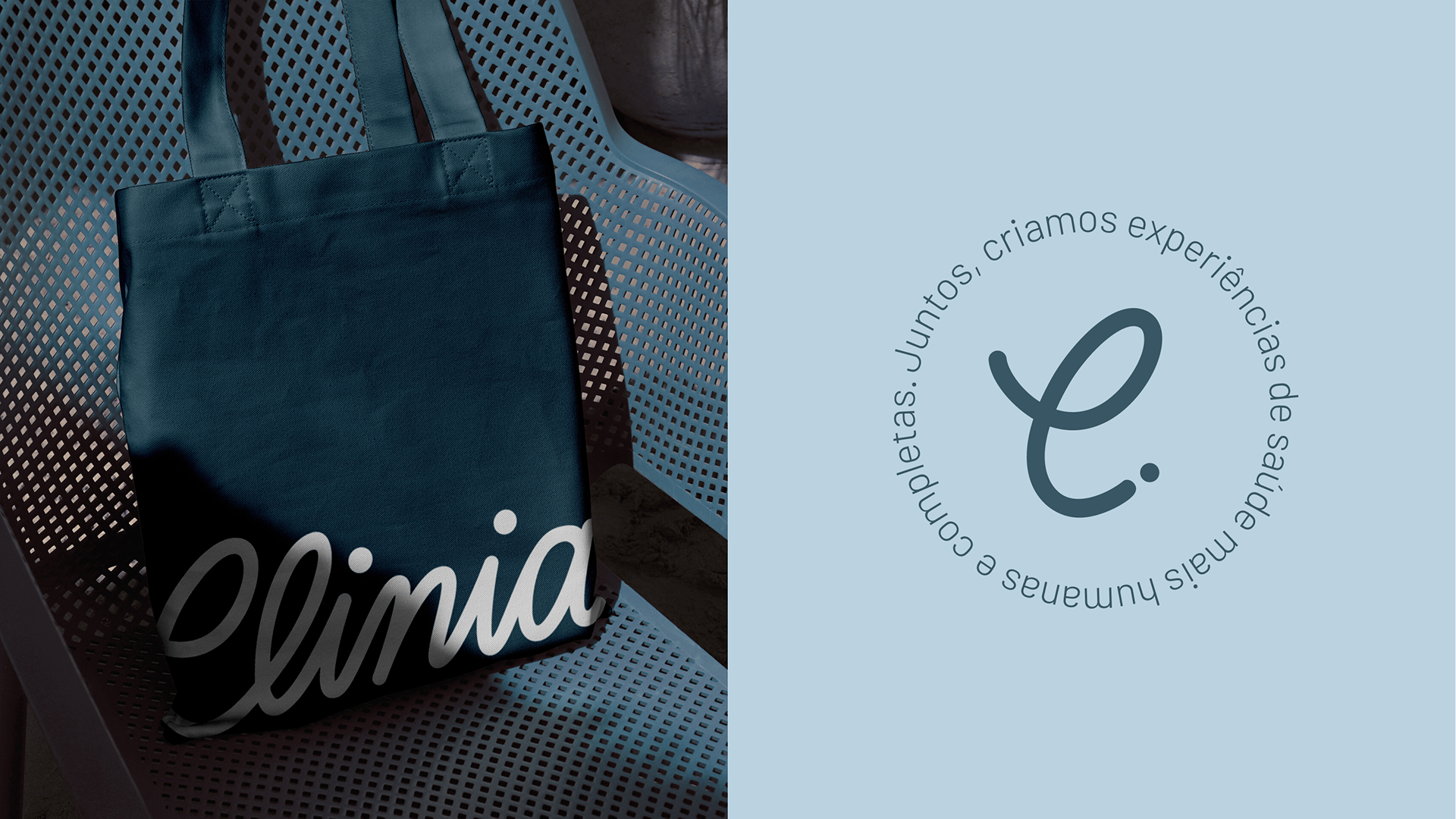
The symbol — a monogram “C.” — is flexible and elegant, used across digital avatars, seals, and stamps. It becomes instantly recognizable, yet remains soft and welcoming. There is no harshness, no rigidity — just presence and clarity.
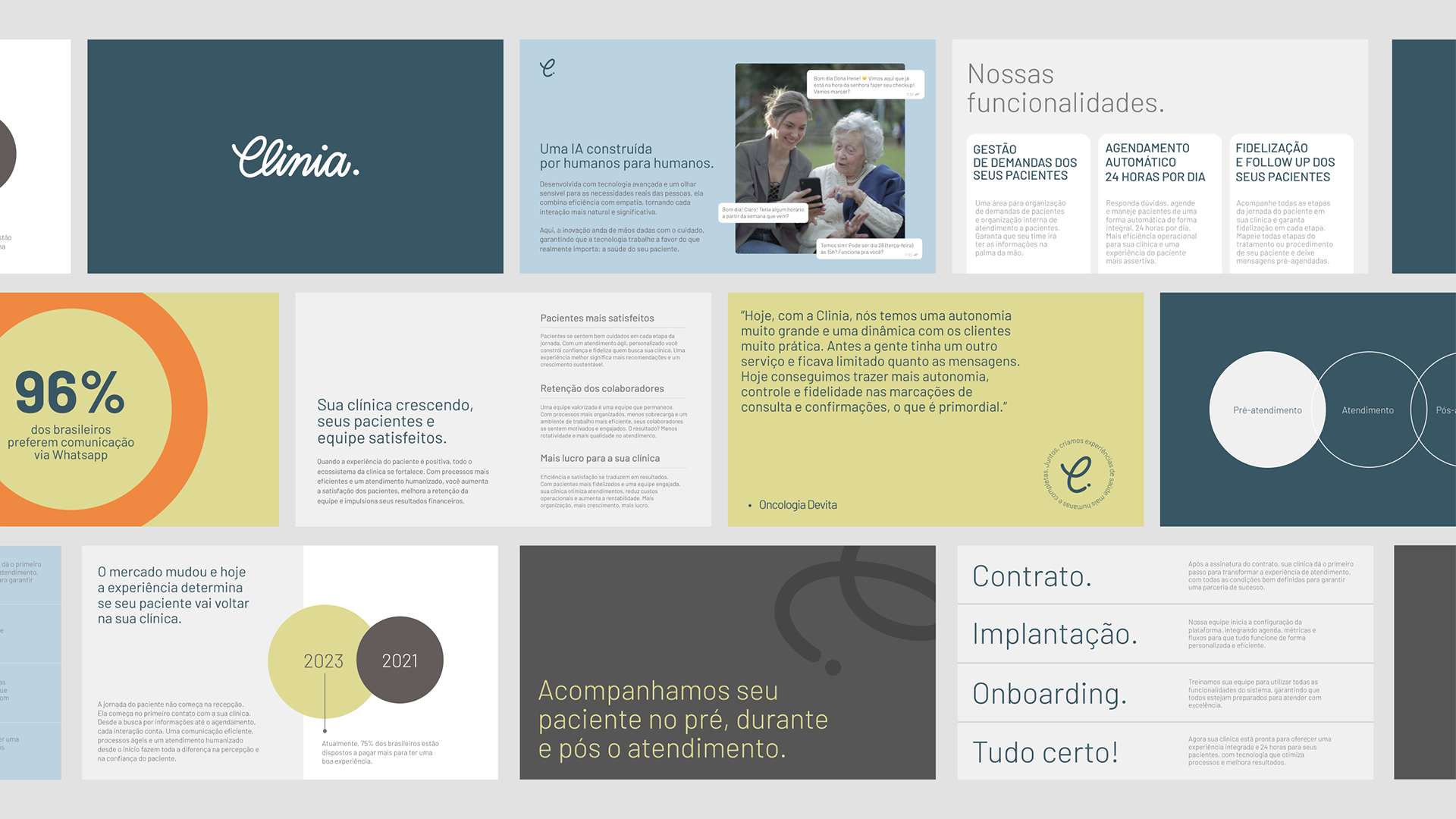
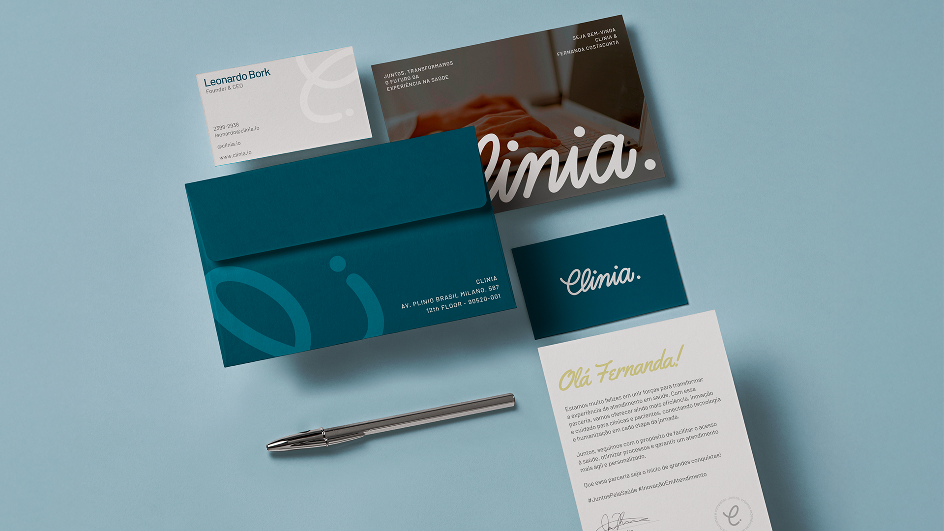
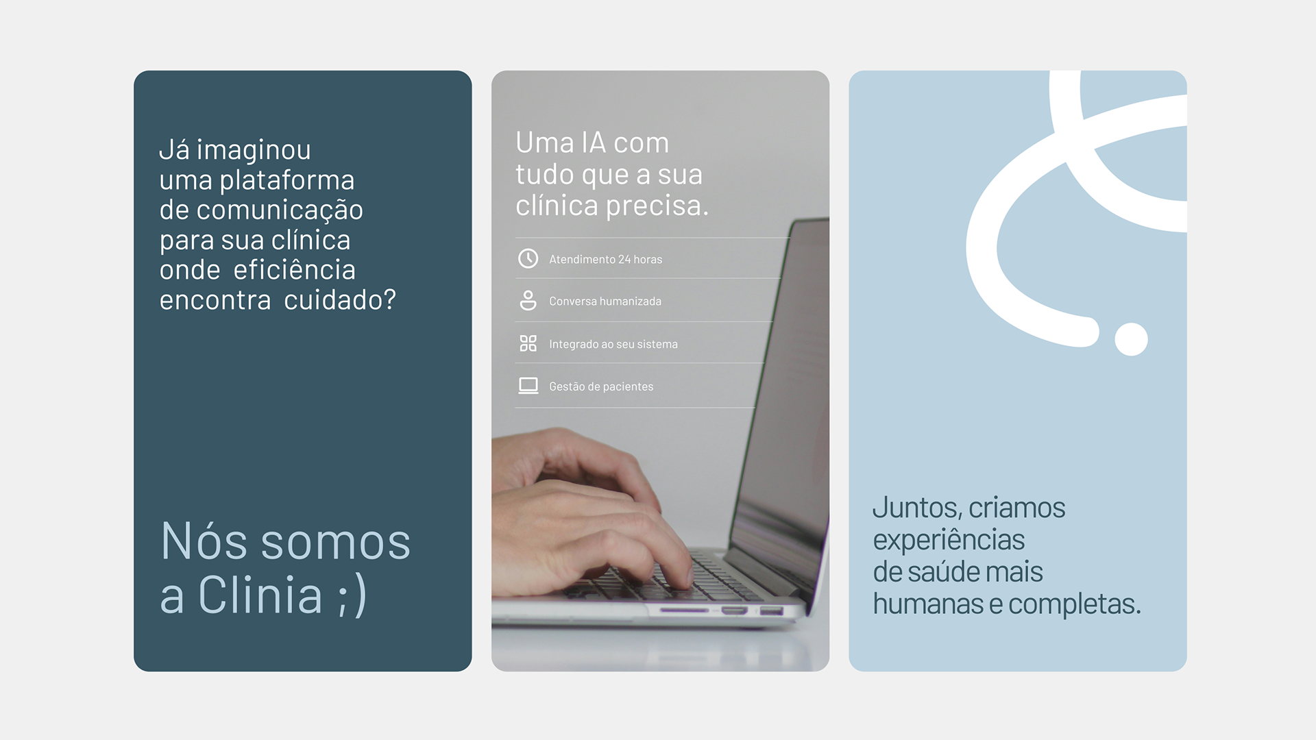
Color plays a crucial role in the emotional tone. The main deep blue expresses professionalism and stability, while the light blue brings calm and breathability. Accents of warm green and gentle yellow energize the composition, making the brand feel alive, never sterile.
Typography is minimal and open, using clean, sans-serif fonts with generous spacing to promote readability and accessibility. From medical dashboards to printed onboarding kits, every text element is designed to make information less intimidating and more digestible.
Thanks!
Visual Identity | Clinia
Design by Laura Mallmann
2025
Design by Laura Mallmann
2025